This tutorial is designed to allow the user to develop
and interpret scatter diagrams. Other additional information is presented within the
History and Key Terms sections of this tutorial so the user will have a better
understanding of scatter diagrams.
The user can venture through the tutorial by clicking on
the desired topic in one of the menus, or by using the scroll on the right side of the
screen to move through the page.
Several examples are also furnished in this tutorial to
enable the user to develop a more clear understanding of the information being presented.
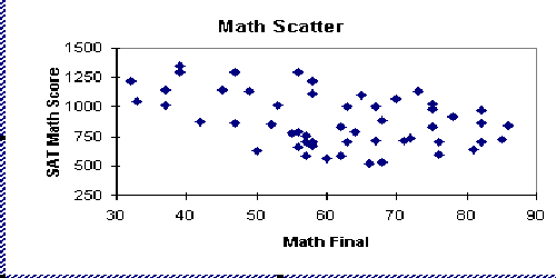
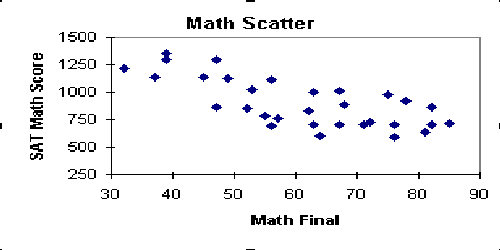
When the scatter diagram has been plotted from the data, the user can view several
different graphs within the Interpretations sections of the tutorial, read the
interpretation of the diagrams pattern, and be able to draw conclusions about the plotted
diagram by comparing it to one of the five possible graph patterns.
Scatter diagrams are used to study possible relationships between
two variables. Although these diagrams cannot prove that one variable causes the other,
they do indicate the existance of a relationship, as well as the strength of that
relationship.
A scatter diagram is composed of a horizontal axis containing the
measured values of one variable and a vertical axis representing the measurements of the
other variable.
The purpose of the scatter diagram is to display what happens to one
variables when another variable is changed. The diagram is used to test a theory that the
two variables are related. The type of relationship that exits is indicated by the slope
of the diagram.
| KEY TERMS | HISTORY | CONSTRUCTION | INTERPRETATIONS
| EXAMPLES | RELATED TOPICS |
Variable - a quality characteristic that can be measured and expressed as
a number on some continuous scale of measurement.
Relationship - Relationships between variables exist when one variable depends on the
other and changing one variable will effect the other.
Data Sheet - contains the measurements that were collected for plotting the diagram.
Correlation - an analysis method used to decide whether there is a statistically
significant relationship between two variables.
Regression - an analysis method used to identify the exact nature of the relationship
between two variables.
| OVERVIEW | HISTORY | CONSTRUCTION | INTERPRETATIONS
| EXAMPLES | RELATED TOPICS |
Commonly, while a cause-effect diagram has been used to describe the
relationship between two variables, the histogram was used to visualize the structure of
the data. However, a means of observing the kinds of relationships between variables was
needed. Using the theory of linear regression which originated from studies performed by
Sir Francis Galton (1822-1911), the scatter diagram was developed so that intuitive and
qualitative conclusions could be drawn about the paired data, or variables. The concept of
correlation was employed to decide whether a significant relationship existed between the
paired data. Furthermore, regression analysis was used to identify the exact nature of the
relationship.
The Guide to Quality Control and The Statistical Quality Control
Handbook, written by a Japanese quality consultant named Kaoru Ishikawa are useful in
providing an understanidng on how to use and interpret a scatter diagram. Ishikawa
believed that there was no end to qualithy improvement and in 1985 suggested that seven
base tools be used for collection and analysis of qualtiy data. Among the tools was the
scatter diagram.
| OVERVIEW | KEY TERMS | CONSTRUCTION | INTERPRETATIONS
| EXAMPLES | RELATED TOPICS |
Collect and construct a data sheet of 50 to
100 paired samples of data, that you suspect to be related. Construct your data sheet as
follows:
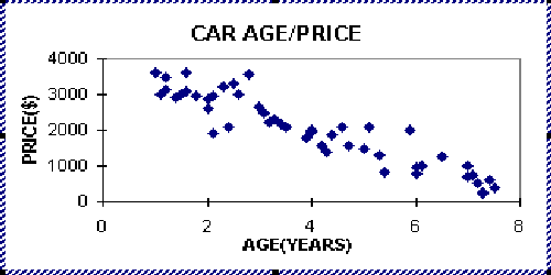
Car Age(In Years) Price(In Dollars) 1 2 4000 2 4 2500 3 1 5000 4 5 1250 : : : : : : : : : : : : 100 7 1000
Draw the axes of the diagram. The first
variable (the independent variable) is usually located on the horizontal axis and its
values should increase as you move to the right. The vertical axis usually contains the
second variable (the dependent variable) and its values should increase as you move up the
axis.
Plot the data on the diagram. The resulting scatter diagram may look as follows:
Interpret the diagram. See interpretation
section of tutorial.
| OVERVIEW
| KEY TERMS | HISTORY | INTERPRETATIONS | EXAMPLES | RELATED TOPICS |
The scatter diagram is a useful tool for identifying a
potential relationship between two variables. The shape of the scatter diagram presents
valuable information about the graph. It shows the type of relationship which may be
occurring between the two variables. There are several different patterns (meanings) that
scatter diagrams can have. The following describe five of the most common scenerios :
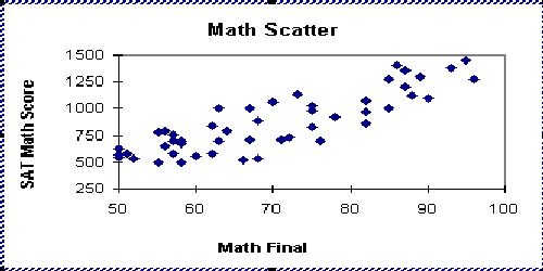
- The first pattern is positive correlation, that is, as the
amount of variable x increases, the variable y also increases. It is tempting to think
this is a cause/effect relationship. This is an incorrect thinking pattern, because
correlation does not necessarily mean causality. This simple relationship could be caused
by something totally different. For instance, the two variables could be related to a
third, such as curing time or stamping temperature. Theoretically, if x is controlled, we
have a chance of controlling y.
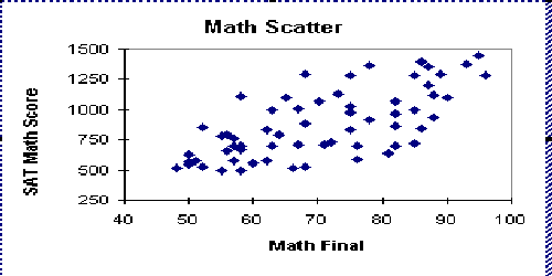
- Secondly, we have possible positive correlation, that is, if x
increases, y will increase somewhat, but y seems to be caused by something other than x.
Designed experiments must be utilized to verify causality.
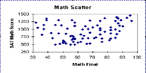
- We also have the no correlation category. The diagram is so
random that there is no apparent correlation between the two variables.
- There is also possible negative correlation, that is, an
increase in x will cause a tendency for a decrease in y, but y seems to have causes other
than x.
- Finally, we have the negative correlation category. An
increase in x will cause a decrease in y. Therefore, if y is controlled, we have a good
chance of controlling x.
Key Observations
*A strong relationship between the two variables is observed
when most of the points fall along an imaginary straight line with either a positive or
negative slope.
*No relationship between the two variables is observed when
the points are randomly scattered about the graph.
| OVERVIEW | KEY TERMS | HISTORY | CONSTRUCTION | EXAMPLES
| RELATED TOPICS |
Situation: The new commissioner of the American Basketball League
wants to construct a scatter diagram to find out if there is any relationship between a
players weight and her height. How should she go about making her scatter diagram?
- Collect the data (Remember to use 50-100 paired samples).
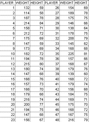
- Draw and label your x and y axes.
- Plot the data on the diagram.
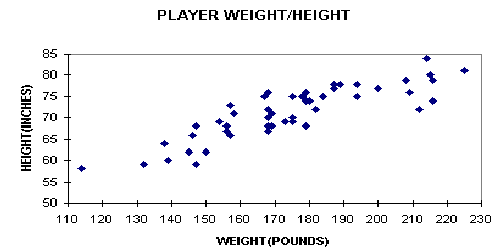
- Interpret your chart.
According to this scatter diagram the new commisioner was right.
There does seem to be a positive correlation between a player's weight and her height. In
other words, the taller a player is the more she tends to weight.
| OVERVIEW | KEY TERMS | HISTORY | CONSTRUCTION | INTERPRETATIONS
| RELATED TOPICS |
| OVERVIEW | KEY TERMS | HISTORY | CONSTRUCTION | INTERPRETATIONS
| EXAMPLES |
Index
|