RUN CHARTS/TIME PLOT/TREND CHART
TUTORIAL OUTLINE
To access the information that you are interested in, select the topic from the Tutorial
outline. At the end of each section is hypertext to enable a user to jump to any section
of the tutorial, or if they wish, they can continue on to the next section by scrolling
down.
PURPOSE
In-depth view into Run Charts--a quality improvement technique; how Run charts are used to monitor processes; how using Run charts can lead to improved process quality
USAGE
Run charts are used to analyze processes according to time or order. Run charts are useful in discovering patterns that occur over time.
KEY TERMS
Trends:
- Trends are patterns or shifts according to time. An upward trend, for instance, would contain a section of data points that increased as time passed.
Population:
- A population is the entire data set of the process. If a process produces one thousand parts a day, the population would be the one thousand items.
Sample:
- A sample is a subgroup or small portion of the population that is examined when the entire population can not be evaluated. For instance, if the process does produce one thousand items a day, the sample size could be perhaps three hundred.
HISTORY
Run charts originated from control charts, which were initially designed by Walter Shewhart. Walter Shewhart was a statistician at Bell Telephone Laboratories in New York. Shewhart developed a system for bringing processes into statistical control by developing ideas which would allow for a system to be controlled using control charts. Run charts evolved from the development of these control charts, but run charts focus more on time patterns while a control chart focuses more on acceptable limits of the process. Shewhart's discoveries are the basis of what as known as SQC or Statistical Quality Control.
| INSTRUCTIONS | RUN CHART EXAMPLE | SOFTWARE | SOURCES & RELATED TOPICS |
INSTRUCTIONS FOR CREATING A CHART
Step 1 : Gathering Data
To begin any run chart, some type of process or operation must be available to take measurements for analysis. Measurements must be taken over a period of time. The data must be collected in a chronological or sequential form. You may start at any point and end at any point. For best results, at least 25 or more samples must be taken in order to get an accurate run chart.
Step 2 : Organizing Data
Once the data has been placed in chronological or sequential form, it must be divided into two sets of values x and y. The values for x represent time and the values for y represent the measurements taken from the manufacturing process or operation.
Step 3 : Charting Data
Plot the y values versus the x values by hand or by computer, using an appropriate scale that will make the points on the graph visible. Next, draw vertical lines for the x values to separate time intervals such as weeks. Draw horizontal lines to show where trends in the process or operation occur or will occur.
Step 4 : Interpreting Data
After drawing the horizontal and vertical lines to segment data, interpret the data and draw any conclusions that will be beneficial to the process or operation. Some possible outcomes are:
- Trends in the chart
- Cyclical patterns in the data
- Observations from each time interval are consistent
| OVERVIEW | RUN CHART EXAMPLE | SOFTWARE | SOURCES & RELATED TOPICS |
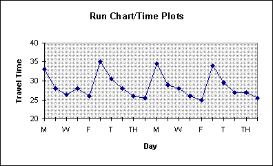
Problem Scenario
You have just moved into a new area that you are not familiar with. Your desire is to arrive at work on time, but you have noticed over your first couple of weeks on the job that it doesn't take the same amount of time each day of the week. You decide to monitor the amount of time it takes to get to work over the next four weeks and construct a run chart.
Step 1: Gathering Data
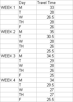
Collect measurements each day over the next four weeks.Organize and record the data in chronological or sequential form.
M T W TH F WEEK 1 33 28 26.5 28 26 WEEK 2 35 30.5 28 26 25.5 WEEK 3 34.5 29 28 26 25 WEEK 4 34 29.5 27 27 25.5
Step 2: Organizing Data
Determine what the values for the x (time, day of week) and day (data, minutes to work) axis will be.
Step 3: Charting Data
Plot the y values versus the x values by hand or by computer using the appropriate scale. Draw horizontal or vertical lines on the graph where trends or inconsistencies occur.

Step 4: Interpreting Data
Interpret results and draw any conclusions that are important. An overall decreasing trend occurs each week with Mondays taking the most amount of time and Fridays generally taking the least amount of time. Therefore you accordingly allow yourself more time on Mondays to arrive to work on time.
| OVERVIEW | INSTRUCTIONS | SOFTWARE | SOURCES & RELATED TOPICS |
- Popular Shareware sites for Spreadsheets and Statistical Software:
- OAK Software Repository
- Popular Commercial Spreadsheet software
- Microsoft Excel
- Lotus 1-2-3
- Borland Quattro
| OVERVIEW | INSTRUCTIONS | RUN CHART EXAMPLE | SOURCES & RELATED TOPICS |
- EINet Quality-Control
- University of Texas Quality Center
- Continuous Quality Improvement at UT-Houston Health Science Center
- American Society for Qualityl
| OVERVIEW | INSTRUCTIONS | RUN CHART EXAMPLE | SOFTWARE |